Ask people what their favorite color is and a clear majority of men and women will answer: “blue!” Maybe not that enthusiastically, but we designers generally get excited about color. Each year, top paint manufacturers issue their color of the year, and I always find it interesting to see what they think we should be buzzing about in the next year. It’s no Pantone Color of the Year, but when Sherwin William introduces its Color of the Year, we run the proverbial color up the design flag pole and dissect it for a hot minute.
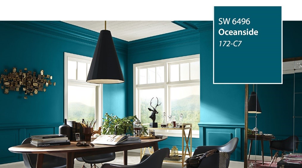
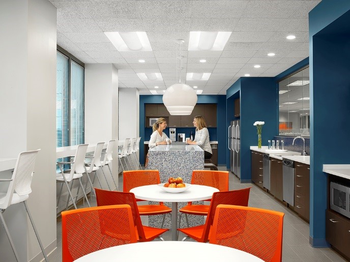
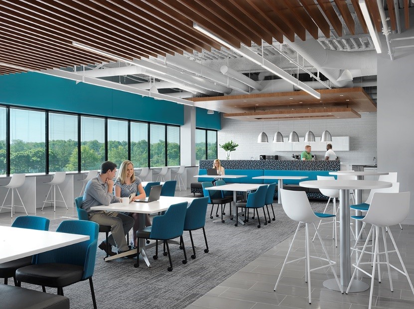
Sherwin Williams Color for 2018 is Oceanside SW6496. Oceanside is a deep vibrant blue hue that evokes the jewel toned elegance seen in hospitality design or even high end residential design. However, we don’t let markets dictate our color story. You’ll see this color used across the board in our studio. It is a tone that works well in a variety of markets, and personally, I’ve specified this tone in the workplace environment from cafes to nurture rooms.
 ja
jaOceanside bridges the gap between true blue and green almost creating a jade experience. Color theory tells us the blueish tones elicit feelings of truth, diversity, eternity, loyalty, constancy, calm, shyness and even death and coldness. While green tones evoke sentiments of growth, contentment, tranquility, hope, springtime, but also sadness and decay. I love that depending on what side of the bed you woke up on these colors can evoke quite positive emotions or (you know)… death and decay.
When these color stories are published, I always try to find a correlation to what is topical or in the current headlines. I would say that “Oceanside” is maybe a “too-soon” nod to the fury of the ocean that has wreaked havoc on our southern neighbors this hurricane season. Just as the color theory descriptions run the gamut of beautiful to morose; it is a nice reminder that the ocean can be both calming and relaxing with its consistent nature and also ominous and even deadly. Do we read too far into these selections and possibly overanalyze? Probably, need to investigate further…
Some people may take this color at face value and call it the rebranded “teal.” Now teal is a four letter word in many design circles, and I have taken a bit of heat for introducing it into palettes and spaces. There is definitely a generational disgust for this controversial color of the early 90s. Those of us in the design community that didn’t endure the stigma of the early 90s teal have a different perspective. Oceanside has a slightly more shaded and deeper hue that hopefully can bridge that gap from teal haters and teal lovers.
This deep blue hue evokes both sides of the emotional paint can for me. I can argue its calming nature in the right environment and also see the drama it evokes. Color perception and how colors tie to personal memories is almost as important in “seeing” color as the R/G/B combination itself. So whether you are a fan of this marine-inspired tone, or you would rather see it go out with the tide, you can appreciate how much color evokes unconscious emotions in all of us. Go forth and paint!