Designed in 2007, Lawrence Group’s previous logo captured our spirit, personality and values. Our mark, or “spark” as we affectionately call it, has seen us through 12 years of evolution and growth. As we celebrate more than 35 years, we wanted to take a closer look at our logo and ensure it reflects who Lawrence Group is today and where we’re going in the future.
Why refine our logo?
In a nutshell, we wanted to elevate the level of design within our brand to reflect the quality of work we create for our clients each and every day. Lawrence Group has greatly evolved since our founding in St. Louis as an architecture firm in 1983. We’ve grown into an award-winning integrated design, development and construction firm with offices nationwide offering a multitude of services to our clients. We wanted our logo to unite our past with our present and exciting future.
Evolving our spark
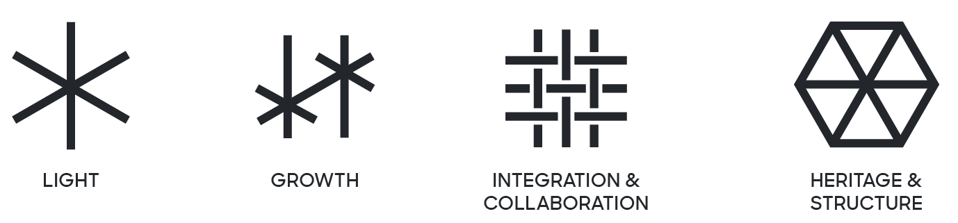
First things first, we love our spark. It’s a visual representation of our creative energy, our fun side and, most importantly, it represents our values (LIGHT). But, if we’re being totally honest, the proportions of the spark didn’t always work well in certain circumstances. Our spark was also developed before we all had tiny devices in our pockets that allowed us to surf the web, connect with friends and run our lives from a park bench.
So we started thinking, how could we improve our beloved spark and have it tell more of Lawrence Group’s story while staying true to the brand we’ve built over the past 35 years?
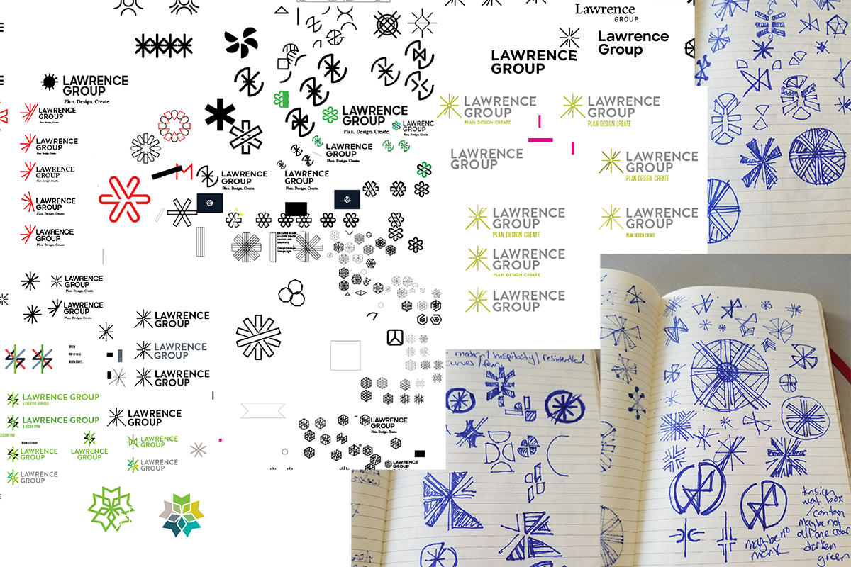
Once we started, ideas beyond just representing our values of LIGHT began working into our creative process. We wanted to showcase the idea of GROWTH, not just Lawrence Group’s, but the growth of our clients as well. Providing better solutions to our clients through the INTEGRATION and COLLABORATION of our services and staff was also a theme we wanted to explore. Finally, we wanted to pay homage to our architectural HERITAGE by visualizing the solid structure and foundation we build for the success of both our clients and staff. All of these themes are visually represented in our updated logo.
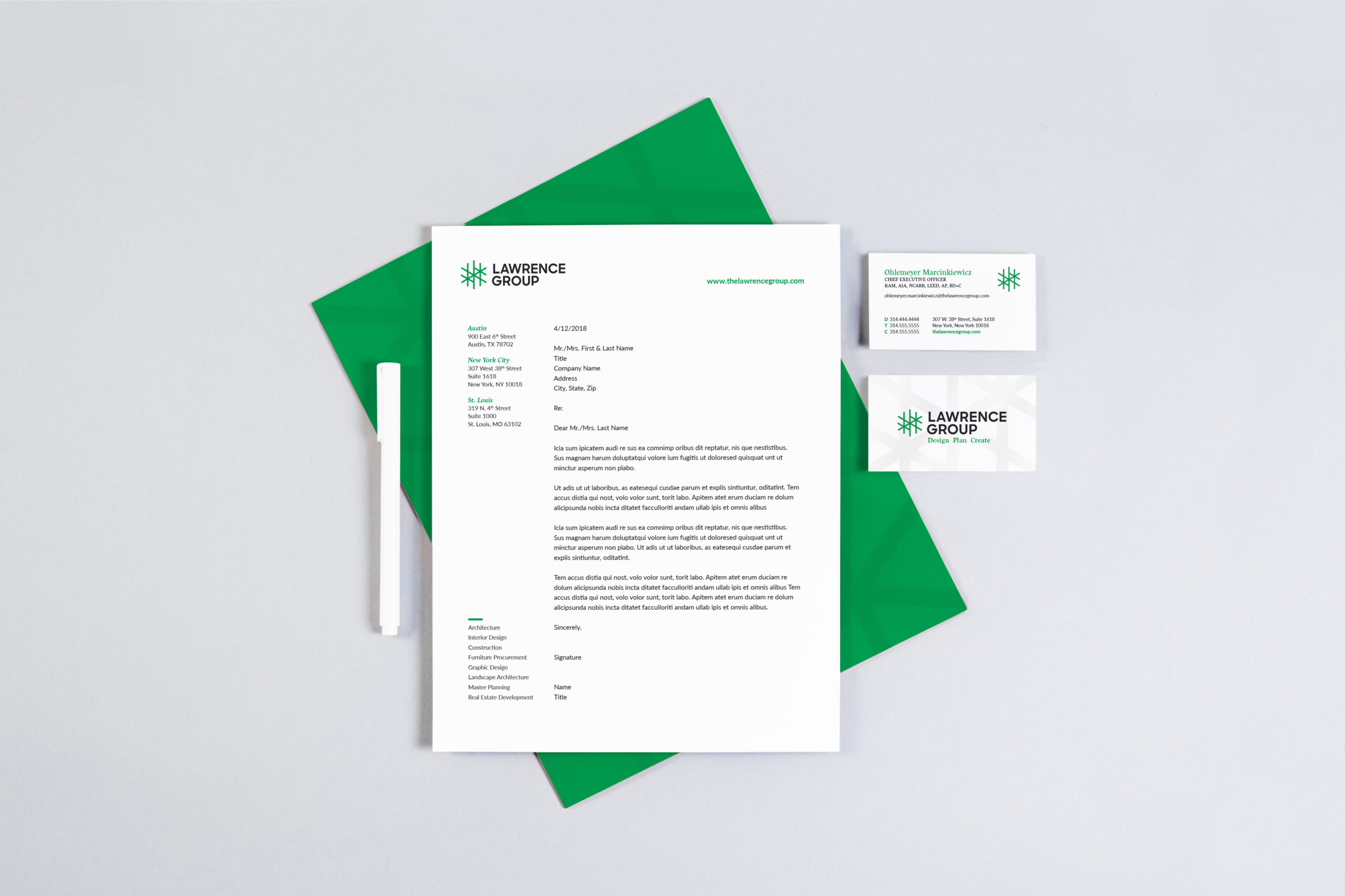
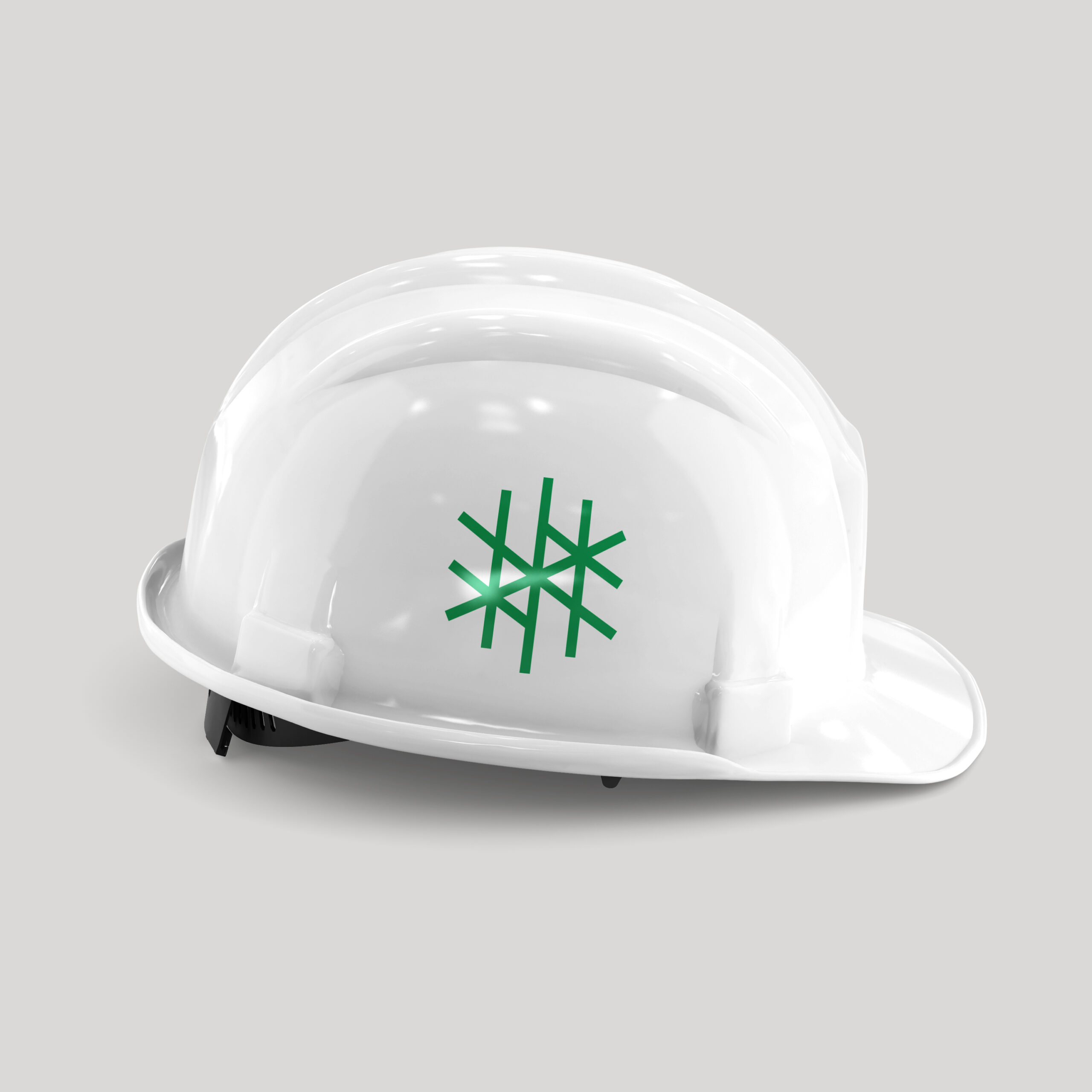
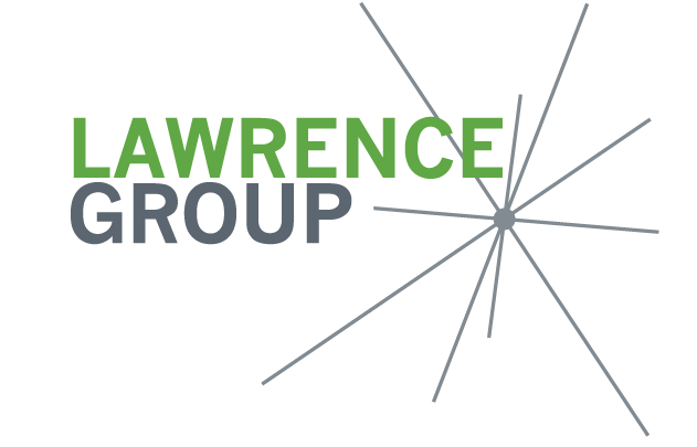
Introducing our refreshed logo!
After much work and many iterations meet our re-imagined spark! Our refined logo is modern and professional, but it’s also friendly and approachable, kind of like us.
We may have a new look, but our mission remains the same: to help our clients realize their dreams. It’s this mission and the talent and leadership of our employees, who make our success possible.